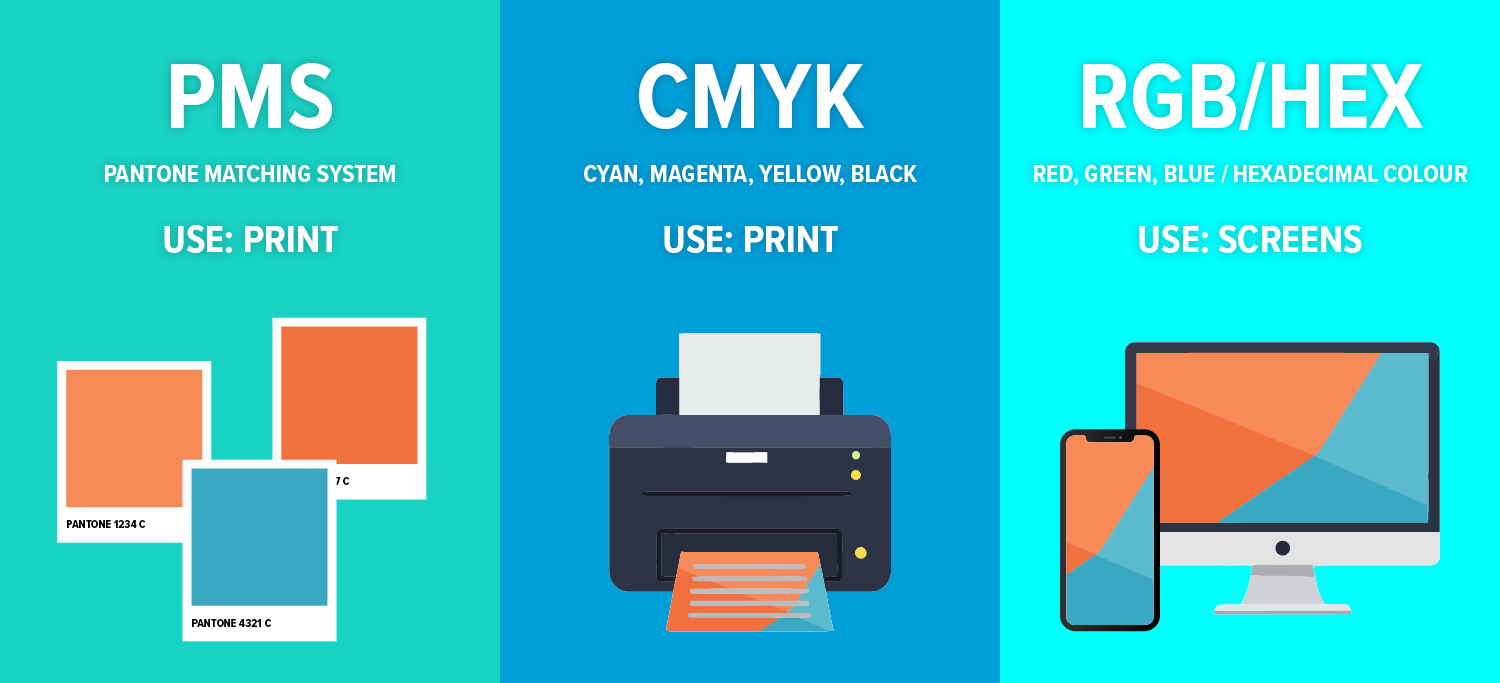
In today’s increasingly digital-first landscape, designers are leaning heavily on RGB and HEX colour formats when developing brand identities. These formats are ideal for screens, which are made up of pixels and display colour using red, green, and blue light. But what happens when that brand needs to live beyond the screen; on packaging, signage, textiles, or printed collateral?
That’s where understanding the difference between HEX and CMYK, and the importance of starting with a Pantone colour, becomes essential.
HEX vs CMYK: A Quick Breakdown
- HEX: A six-digit code used in web and digital design, representing RGB values. Perfect for screens, but not ideal for print.
- CMYK: A subtractive colour model used in printing, combining cyan, magenta, yellow, and black inks. It’s the standard for physical media but doesn’t always match what you see on screen.
While HEX and CMYK serve different purposes, they don’t always translate seamlessly between digital and print. Colours can shift, lose vibrancy, or appear inconsistent depending on the medium.

Why Start with Pantone (PMS)?
The Pantone Matching System (PMS) is an internationally recognised colour standard used across industries. From graphic design and printing to paint, textiles, and product manufacturing. Each Pantone colour is precisely formulated to ensure consistency, regardless of where or how it’s reproduced.
Benefits of Starting with Pantone:
- Cross-Media Consistency: Pantone colours are designed to remain consistent across digital, print, paint, and fabric.
- Reliable Conversion: PMS colours can be accurately converted to CMYK, RGB, and HEX formats, making them a solid foundation for any brand.
- Global Recognition: Pantone is a universal language for colour, reducing miscommunication between designers, printers, and manufacturers.
- Brand Integrity: Starting with Pantone ensures your brand colours stay true across all touchpoints.
The Takeaway
While HEX and CMYK are essential tools in a designer’s toolkit, they’re not interchangeable. Starting your brand design with a Pantone colour ensures that your visual identity remains consistent and professional. Whether it’s viewed on a screen, printed on a brochure, painted on a wall, or woven into fabric.
In a world where brands live across countless platforms, Pantone is your anchor for colour consistency.


