


Colour Psychology.
Did you know that dark blue is considered the world’s most relaxing colour?
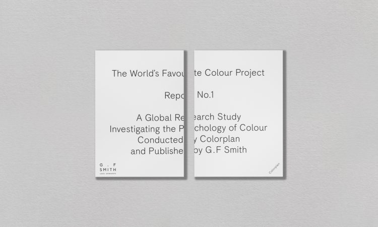
Well, that’s according to an international study conducted by G. F Smith (think Colour Plan paper) of more than 26,000 people from over 100 different countries.
Strategic use of colour can bypass logic and speak directly to the subconscious, influencing human behaviour and emotions, even our buying decisions. 85% of all buying decisions are based on colour, making it your most powerful first impression. Further to that, correct and consistent use of colour increases brand recognition by 80% triggering connection with your audience.

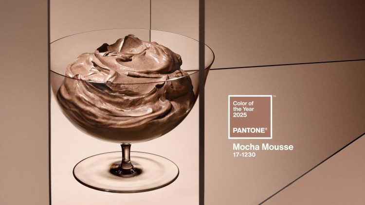
Each year Pantone captures the global mood by releasing it’s ‘Colour of the Year’. This year the colour is Mocha Mousse 17-1230 suggesting a global desire for comfort. From fashion and beauty to interiors, the impact is far reaching across the globe.
But colour psychology isn’t always about following trends. Getting colour psychology right can trigger instant emotional connections that cause people to feel, remember and act. Understanding colour psychology can be an invaluable resource in your marketing tool kit.
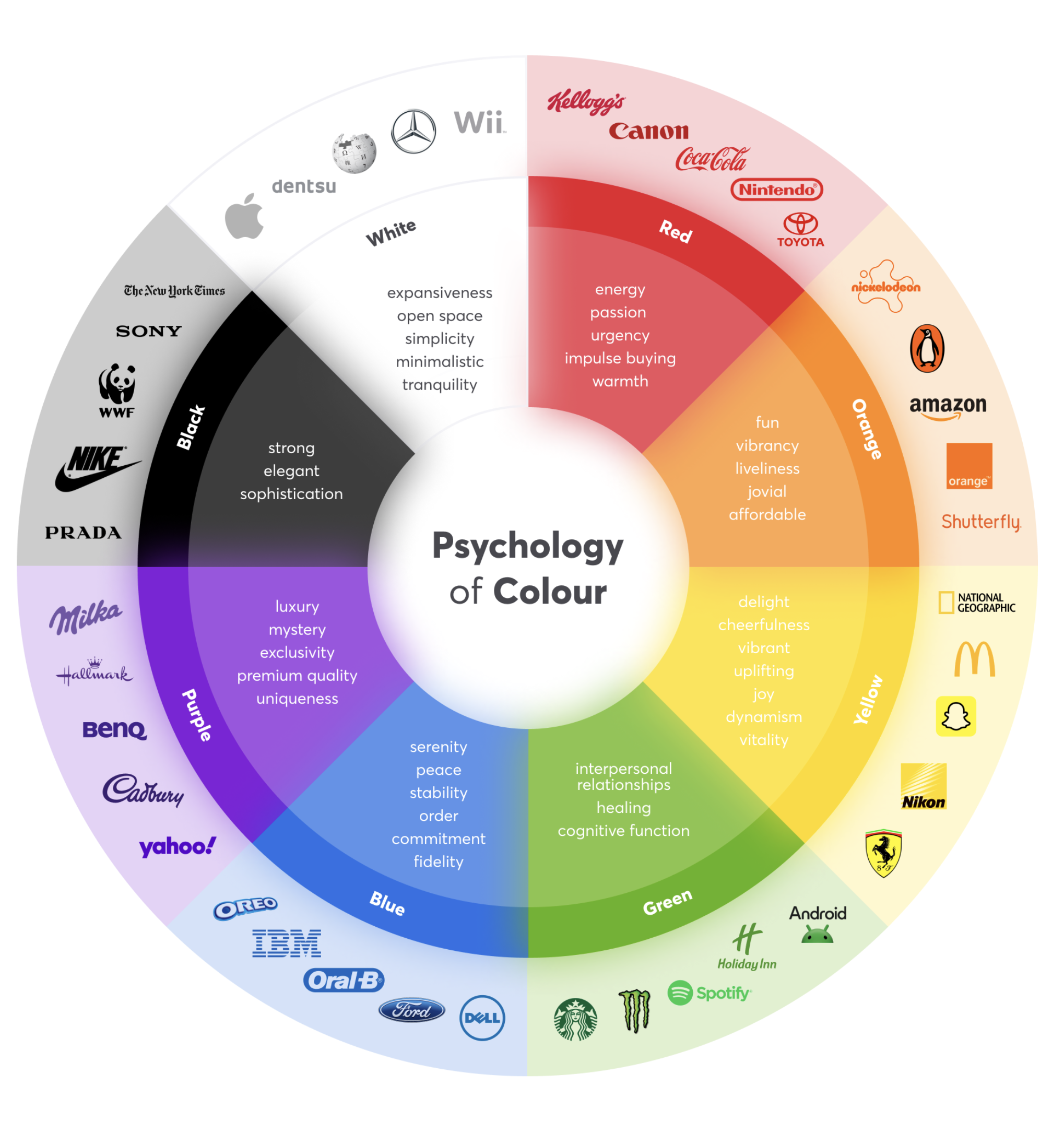
Here’s what each colour communicates in branding:
- Green: Peace, growth, abundance, harmony, vitality, and wellness. Ideal for eco-friendly, health, and outdoor brands.
- Blue: Harmony, trust, serenity, consistency, safety, and honesty. Common in finance, tech, and healthcare for reliability.
- Black: Security, sophistication, prestige, strength, and mystery. Perfect for luxury and high-end products.
- Orange: Innovation, ambition, excitement, fun, warmth, and confidence. Great for creative and energetic brands.
- Pink: Sweetness, femininity, love, compassion, and comfort. Often used in beauty and lifestyle sectors.
- Yellow: Focus, happiness, optimism, hope, and friendliness. Works well for cheerful, approachable brands.
- Purple: Mindfulness, luxury, creativity, intrigue, and imagination. Associated with premium and artistic products.
- Red: Awareness, thrill, love, intensity, and power. Best for bold, passionate, and attention-grabbing campaigns.
Why it matters: Choosing the right colour can strengthen your brand’s message and emotional connection with customers.
So next time you are considering the paper stock for your product packaging, or choosing a shirt for that big important meeting - try a more strategic approach using the power of colour.
If you’d like to learn more about colour psychology and how it can help your brand, get in touch with our graphic design team.